Sunday 15 April 2012

How did you use new media technologies in the construction and research, planning and evaluation stages?

Technology I Used
  • Prezi
  • YouTube
  • Blogger
  • Final Cut
  • HD Cam-Corder
  • iPhone
  • Picnic (soon to be Google+)
In this task we used a range of technologies to make sure our film looked as professional as possible, we needed to use technology so that we could make the film flow as well as possible, all though we had not used a lot of these so had to learn about them.

Prezi
Prezi is an online slide show creator that is free to use. I have not previously used this sight before studying film noir and is a nicer more professional alternative to Microsoft Powerpoint. I used this a lot so that I annotate my research and my ancillary texts. I believe the prezi presentations I have made are very clear and look good and help explain my reasons for choosing certain aspects of my film and ancillary texts.

YouTube
We have used YouTube to upload our film and also some of my reviews, this makes it simpler to keep your videos in one place under your own user on YouTube.

Blogger
I have used blogger to update and keep track of my progress and have enjoyed using blogger and think it is a good tool for social media. Blogger is certainly something I will use so that later on in life I can look back upon. It is very simple to use and is similar to Word and I have not struggled to operate the site. The only problem I did have with this site was that I could only access my blog from home and not on any other device, therefore I could not go on blogger at school, this was inconvenient and had to be worked around.

Final Cut
Final Cut is the program that come with Apple Macs and is used for editing film. We had previously used them before but only to try and get a feel from them. I found it especially hard using them and when we first started editing we had problems uploading our clip to the Apple Macs but this turned out to be a problem with the computer so we had to start again on another PC. Overall I have improved a lot in my final cut ability after spending many hours up in the suite.


HD Cam-Corder
For filming our movie we used a Panasonic HDC- 1040, we needed to use a good quality camera so that the finished product looks good in the end. Our camera was very simple to use and uploading was not difficult. I done the majority of the filming and as I have never filmed before I enjoyed being able to create good shots with the camera angles. If we were to do anymore filming I would definitely buy a tripod as some of the filming is a tad shaky.

iPhone
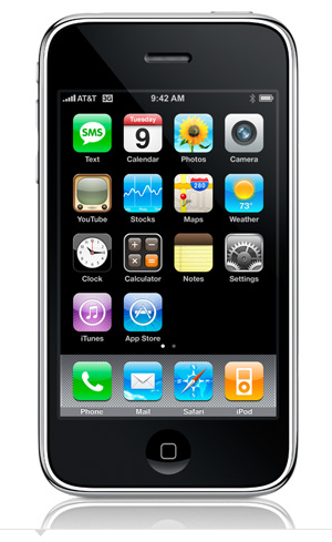
I used my iphone to recorded me talking about ancillary texts, it was very simple to use and I could remotely upload the videos straight to YouTube which saved a lot of time and effort. The camera quality is not the best and if I was to record again I might use the HD Camera but I didn't have it at the time but the iPhones camera is good enough for the task required.


Picnic
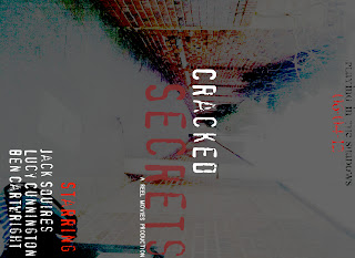
Picnic is an online image editing site which when I used it was free because it was closing down so I got all of the premium features which made my ancillary texts more professional. I have used picnic before many years ago and it is a very good site for editing pictures.

Friday 13 April 2012

What have you learned from your audience feedback?

Our audience feedback came from other media students when the media department held a film showing on the last day of term. We received many good reviews on post-it-notes from class mates.

'Good lighting in alley scene' - We believe this was definitely one of our best scenes and the shadows cast look really impressive against the brick-wall so we were happy.

'Murder scenery good but death not to realistic' - We knew this would be a problem and it was not because of our actor, we did not have the tools to create blood splatter out of Sheldon Rex's head and when filming we did take another angle but a car drove past and made a noise. However we stuck with the shot and it still looks good and the audience can understand what it happening throughout.

'Good music, SFX' - This was something we spent a lot of time on and sourcing them from different sites and making sure we didn't breach any copyright so that our video would not be taken off of YouTube.

'Powerful story' - Very happy with this comment as script writing took a long time.

'Staircase shot could have used high-heels' - This was a very good idea which we did not think of, this would have allowed us to use another film noir concept.

'Good acting but maybe more emotions could be shown in death scene' - This is a fair comment but we believed that Sylvia would not care that Sheldon was killed because we loves her husband. Also when Rex is about to die his character changes because he has given up, this is seen when he tells Reece to hold his jacket.

'Film flows well but could use film in voiceover' - This is something we defiantly wanted to change but we ran out of time, when we get back after half term we will add clips to these scenes.

Overall we are very happy with our reviews as they were anonymous so people can be cruel but our reviews are overall positive or constructive feedback.

How effective is the combination of your main product and ancillary texts?

I believe my main product and my ancillary texts work well. It helped making the film first and coming up with key ideas so that you can incorporate them into your products. The film poster definately doesn't give away to much about the film which I though was key as many of the posters almost spoil the ending and the research I done showed that you can pretty much guess the ending. My poster looks a bit like a horror film poster but that was expected as I wanted to emphasis the murderous theme in our film. The shot used of the alley is also a scene of our film so when the audience watch it they will realise that it is an important scene. Our film Cracked Secrets needed to feature in both products too, the font I have used in both of my ancillary either relates to film noir or the film. In my poster I use a typewriter font and in my review I use a font from the video game LA NOIRE. Making sure the ancillary texts relate to the film is very important so that the audience can recognise them. By having both my products quite dark and eerie relates to the film and its genre, the review uses a night time shot and a casting shadow which creates tension. In film reviews I looked at they all use a screen shot from the film, so I picked my favourite shot from the whole film. Both my ancillary texts include the colour red which we wanted to include in our film but we though black and white would be more important. In the review I use a burgandy colour and the poster I use a red colour both of these signal danger. I choose not to use black and white in my film poster because it would be boring and not catch the eye of people walking by, the colour of the bricks really stand out and so does the date.
I believe my ancillary texts work really well and they sell my main product.

In what ways does your media use, develop or challenge forms and conventions of film noirs.

Our film uses many classic conventions of film noirs;
We use black and white throughout the whole film. Most film noirs use black and white and noir itself in French means 'black film'. Black and white film makes the whole film seem darker which adds to the eeriness of the film. Black and white used in film noirs in the late 1940's and early 1950's and only the more recent films have used colour such as Brick and LA Confidential.


Another convention we used was that the film is set in America, a lot of the film noirs at the time were set their such as The Big Sleep and LA Confidential. As it was set in America all the actors needed to use an American accent which was quite hard to do. We decided that our femme-fetale should be English and should speak in a posh accent so that it distinguishes her and makes her more seductive and intelligent.
We used an all time classic convention in film noirs which is venetian blinds.
example:
Lola - Double Indemnity
The reason we used this concept was that it creates mystery as it does not reveal the identity of the person. It creates bar which in our film represents a prison/trap/cage like effect. When used in our film Rex is meeting up Sylvia and this suggest she is luring him into her trap.
Themes that we used which are not necessarily common in film noirs was that we let our murderer get away in the end and is never caught, in American film noirs the perpetrator is always caught. The reason we decided to let him get away was because we wanted to use some realism in our film so that a UK audience could relate to the film. In the UK a lot of our films and TV uses realism where in the UK it is not.
Another concept you do not see in film noirs that often was that we left the film on a cliffhanger when the audience is not left knowing if Reece kills Sylvia this is because this scene builds a lot of tension and keeps the audience on their seats. After the film it makes the audience think and talk about what they think the ending would be. This creates a form of promotion 'word of mouth' for the film which is only a good thing.
We used cigars and cigarettes in the film as well, we believe this was important as at the time smoking was seen as cool therefore we needed the main characters to be seen as idols for the audience viewing it back then. It also creates a smokey scene which adds to the mystery of our film, the difference between Sheldon smoking and Reece shows the divide socially between the two, Reece is pictured with a huge cigar while Sheldon has a small cigarette.
We used murder as a key theme which in all film noirs is a focal point, it adds drama to the film and makes the film much more interesting. Usually in film noir the murder is more subtle than a gun shot but we felt that as our scene is in an open area it will echo and create a nice sound.
Having a femme-fetale was also important to us and we needed it in our noir as she is the main character and develops the emotions for the two men.
We used politics and corruption as a theme in our noir which I have personally not seen on a governmental level, this in 1950's would have caused a stir but common films have embraced this concept.
We had many common angles seen in film noirs such as canted angles and angles that showed position of power, this is mostly seen when Reece points the gun at the two at the table. The over the should low angle shot really shows who is in charge.
We used power as the key theme in our film, all of the characters want power over one another, Reece wants power being that he wants to be governor, Rex wants power over Reece by being able to publish this story he will become a big player in the journalist industry. Sylvia wants money which brings power and she has power over both the men, this is seen throughout the film and how she manipulates them and plays them against each other.
We used a mirror shot which is classic in film noir, this is seen when Reece Freeman is about to discover his wife and Sheldon Rex together.

We added a scene in which had to talking at all which is not common in film noirs, either there is talking or no talking throughout the whole film. Combining the two worked really well and made the scene stand out. The acting and the camera angles meant that no words actually needed to be said and the audience could still understand what was going on.


Film Poster

Research
For my research I decided to look at some films posters from todays era and in the past so I can compare the differences between the two. I will also looks at a film noirs poster to gain some knowledge of techniques that they use. I will look at a film which involves murder as this is a key theme of my film and also the spooky/eerie tension that is created throughout the film.

Film noirs: a lot of film noir posters are hand drawn as at the time they would not have had the powerful tools of computers. examples:
As you can see they all are cartoony, which is not the style I want to use as I can not draw and also I do not think it is affective. The film posters also give away too much information about the film, as film noirs are meant to be mysterious you can pretty much guess the plot straight away. This is why in my film poster I will not give away too much information about the film.

My Poster


Presentation on my poster

Tuesday 10 April 2012

Film Review

Research
I have looked at some film reviews from Empire magazine, Empire is a film and TV magazine and has many reviews of films. Today I looked at two articles from the film and have picked up a few tips which I will use in my own review.

This is a video of an article from Empire Magazine the film is called The Help and the video has made me realise I could use some of the techniques used in Empire. The parts I most like about this article is definitely the important quotes as they stand out from the rest of the review, I will definately use this in my own magazine. I also like the name of the magazine Empire and I will use a name which also relates to royality and importance.


This is a video of Moneyball an article from Empire magazine. This was my favourite article from the whole magazine and will look a lot like my own magazine. I like the outline of the page and how it is appealing. The image of the man standing their  who is the main character in the film dominates the page which is effective as it is Brad Pitt who is a very famous actor.


Ideas for my own film:
  1. Similar layout to Moneyball
  2. Shapes of colours outlining the pictures
  3. Page numbers
  4. Main focal picture and one other smaller picture (different scenes)
  5. Title of REVIEW at the top of the page somewhere
  6. Small information about picture in top corner
  7. Title of film on top of the picture.
  8. Text on the picture
  9. Maybe using the DVD case on the review
  10. References to other reviews in the magazine
  11. URL of my magazine for online reviews
  12. Star ratings are definitely needed.
  13. A key facts box
  14. Double page not singular
  15. An icon which makes the magazine stand out and recognisable. (I will have to create a logo for the magazine)
  16. A good, short and catchy name so its memorable
I will not be able to use all ideas but would like to incorporate as many as possible. This is my rough plan of my review I have also numbered the picture to compare to the list above to see how many concepts I could use:


Finished Product:
(This is a double page review and would have a line running down the centre.)
This is an insight to why I made the choices I have for my review.

MY REVIEW -A presentation about my review

 
-A video about my review

Overall I am very happy with my final review and it looks a similar layout to the Moneyball article which is what I was aiming for.

Film

This is the final product. I am proud of the film as it has many noir concepts. The film is enjoyable and has a lot of drama.